

 This topic is locked
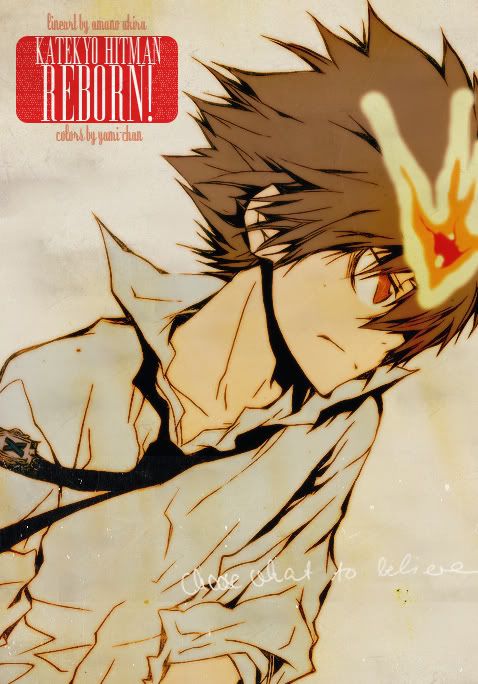
το logo ηταν του scan και μετα απο μιαμιση ωρα σε 1600% zoom δεν αντεξα να το καθαρισω και αυτοΤελικα καταλαβα οτι το original logo του manga δεν ταιριαζει στο στυλ που ειχει ιοθετησει πια...reborn is kewl now and the logo looks kinda more funny. I dont think they match as well anymore :/
Other than that as usual this is one helluva job. Kudos yami-chan:lovulovu:

I like it though >3


 ...αν προσεξεις..υπαρχει μια μεγαλη γρατζουνια 4 times...


 +
+  +
+